Mobile Website
Videdressing's new Mobile platform

CONTEXT
Regarding the increase of people using mobile browsers to consult websites, we wanted to give our customers a better experience on mobile devices (outside apps). To improve this experience we decided to make a mobile website and create a new platform perfectly adapted to mobile devices. We also took this project as an opportunity to set a new brand identity.
You can try it live on your cellphone at m.videdressing.com
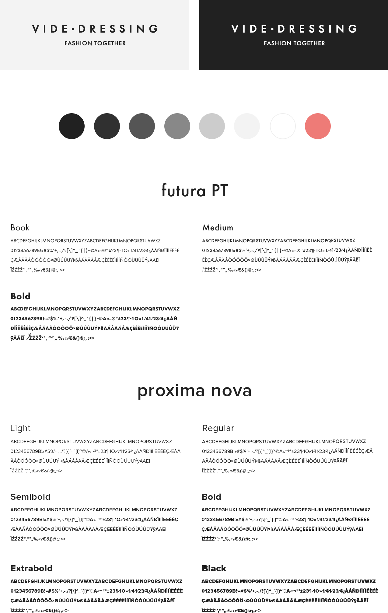
A NEW GRAPHIC CHARTER
The new graphic charter that comes with the new identity consists of a new logo, new colors, new fonts. We wanted to modernized and upgrade the look and feel of the general interfaces, giving it a more sober and high-end appearance.

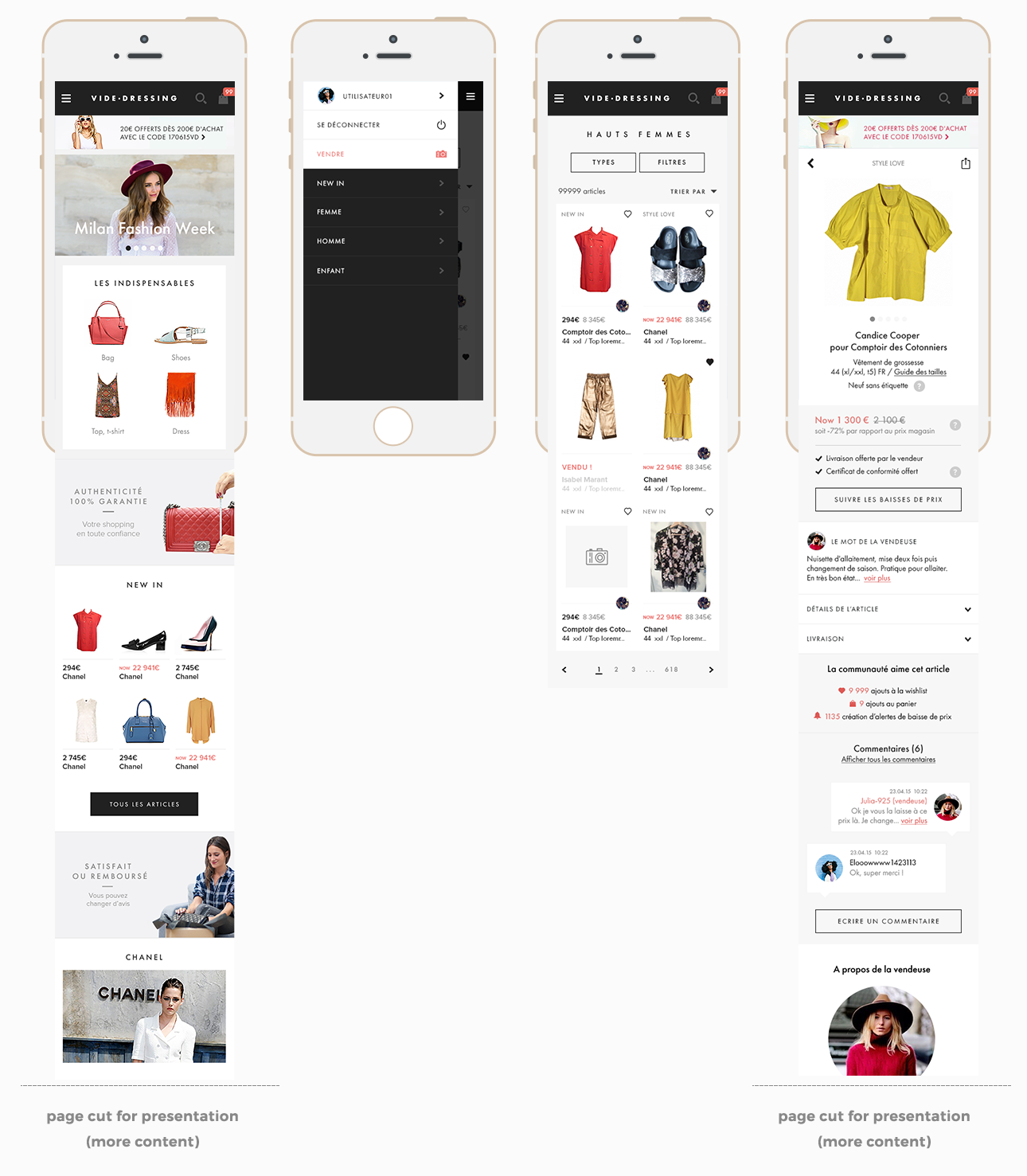
MAIN NAVIGATION
The main navigation regroups the different pages that allow the user to browse the site content, from homepage, to the product page. Here you can find the different view of : Homepage / Menu / Catalog / Product Page.

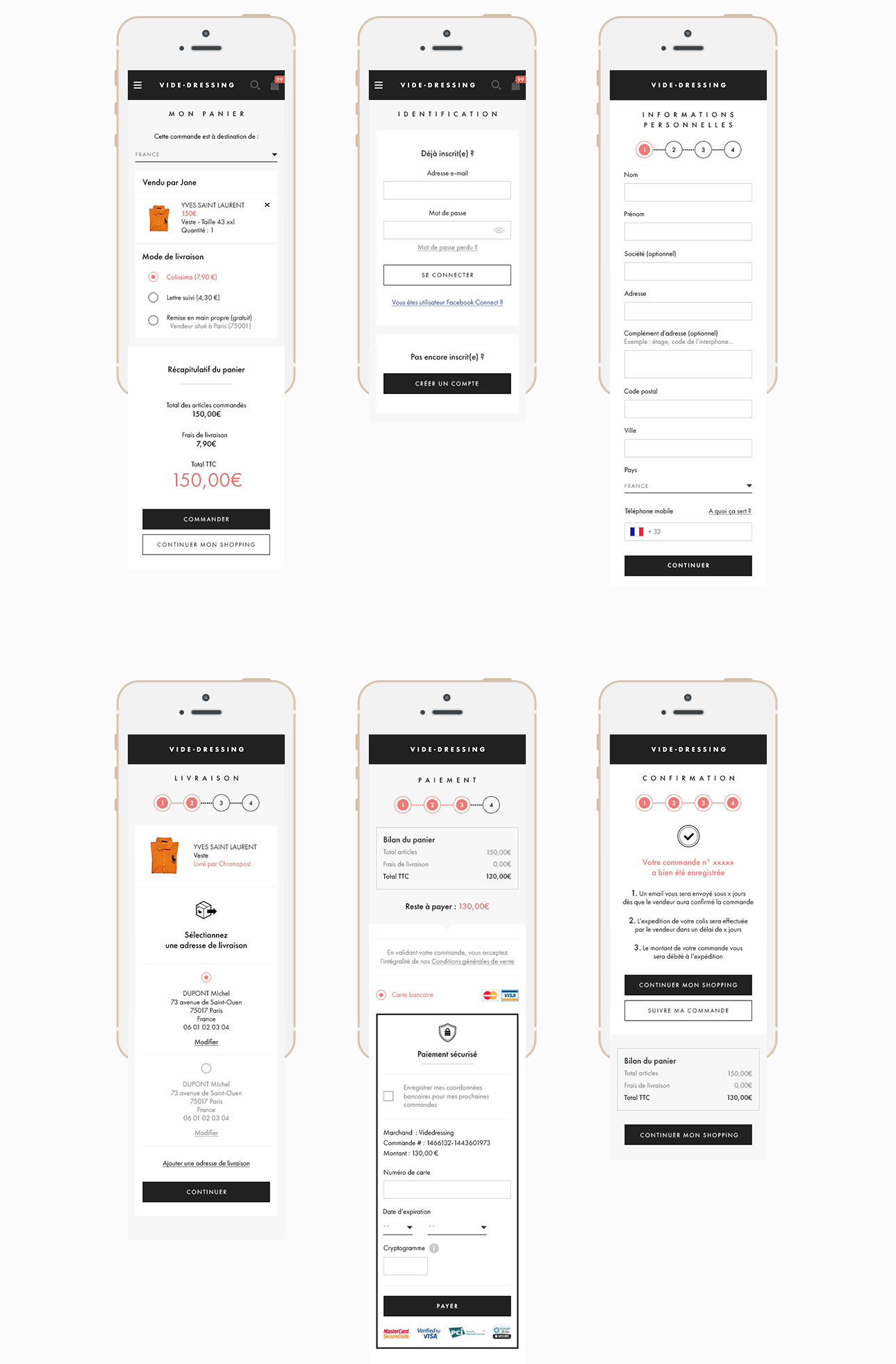
PURCHASE TUNNEL
The purchase tunnel is one of the most part of the mobile website due to its key business function and its reinsurance for customers. It regroups all the mock ups from the cart to the checkout.

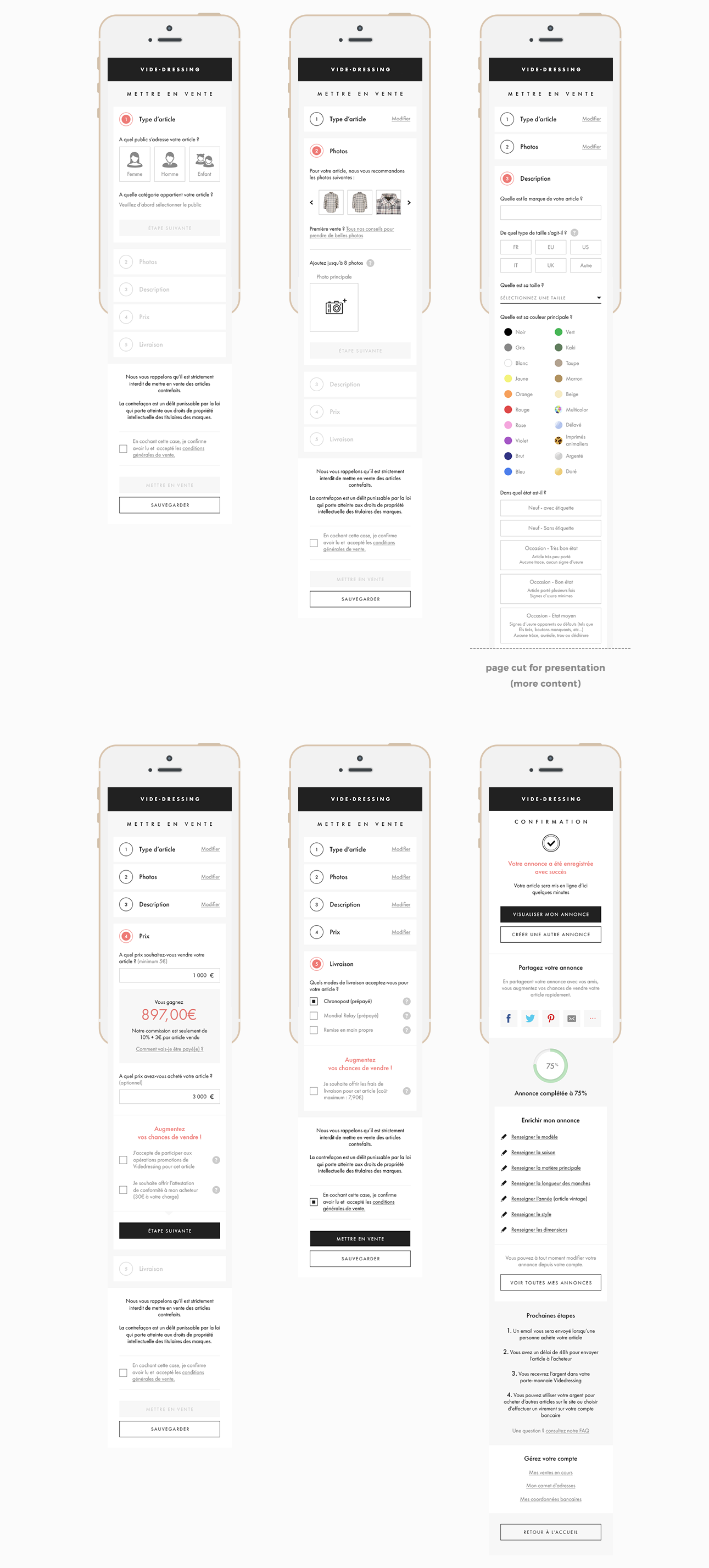
SELLING TUNNEL
The selling is also a key feature of Videdressing’s business as a C2C plateform we need buyers and sellers. That’swhy we’ve been focusing on creating a enjoyable experience to our users by making a more efficient and clearer selling form.


