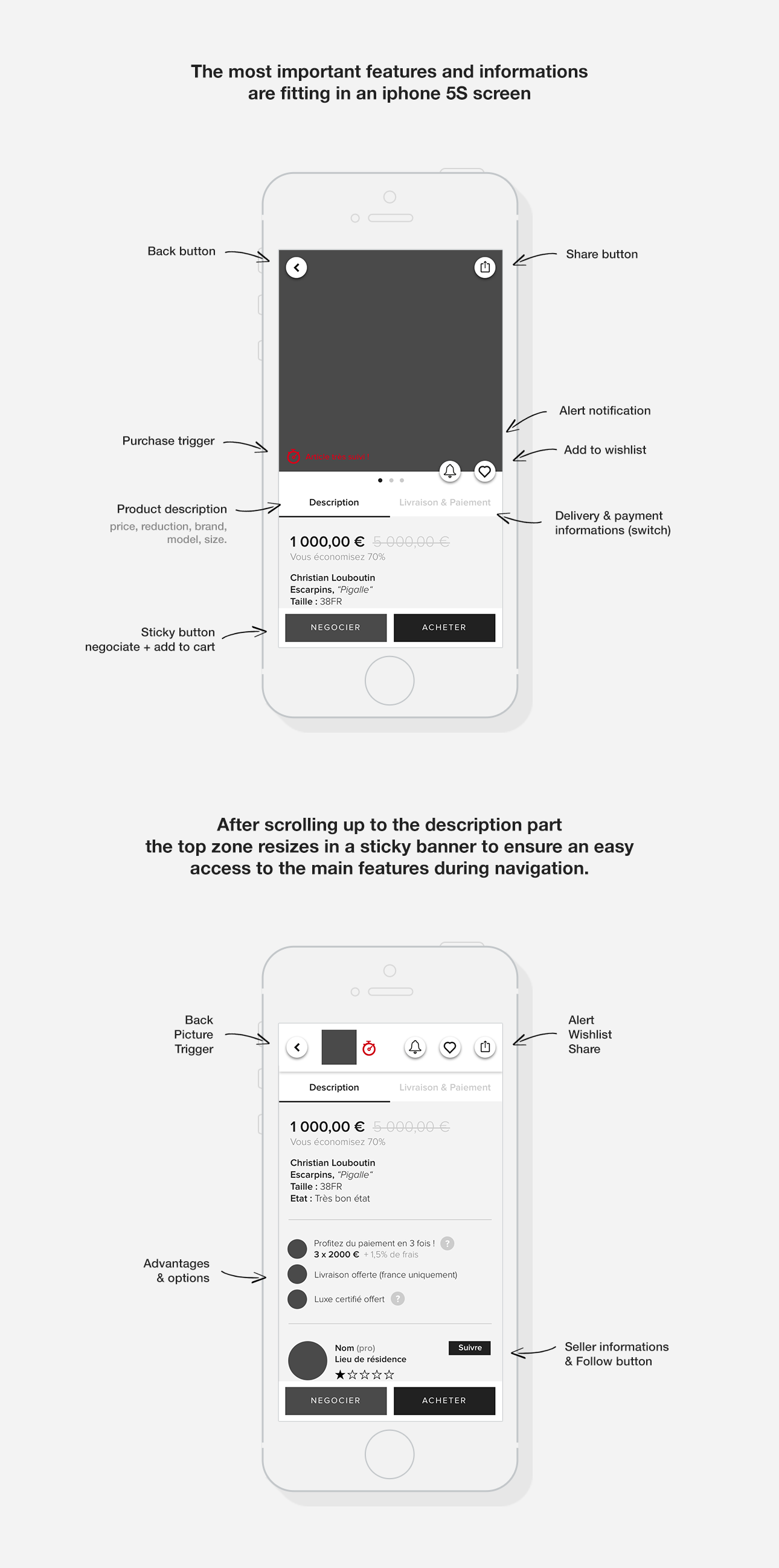
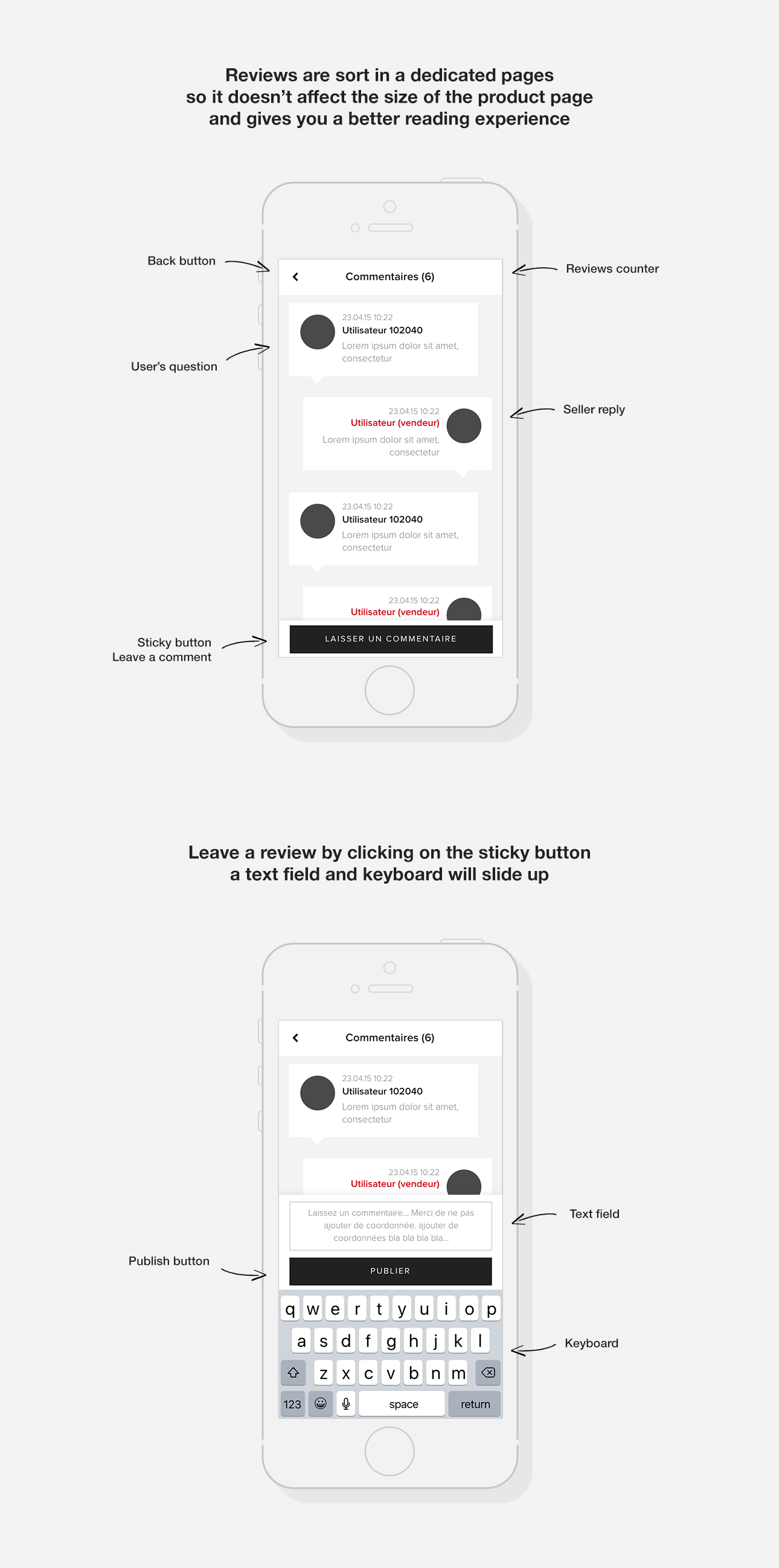
Videdressing IOS product page
review of the app IOS product page
CONTEXT
In order to improve our product page, keep it useful and trendy, we decided to make a complete review of it, adding features and pushing forward the user experience. For this, we benched a lot of other apps such as : Asos, Zalando, Vinted, Tradesy, Ebay & others to figure out what was the actual powerful user experience, taking notes of all the good and bad points to have a ideal starting point. We then sorted and regrouped elements in order to put in place a first basic zoning to experiment and discuss about. After this we began to design mock ups of what it could be like, using sketch, principles and invision to set animations. Here is a quick presentation of the result of this page review.


