Videdressing Homepage
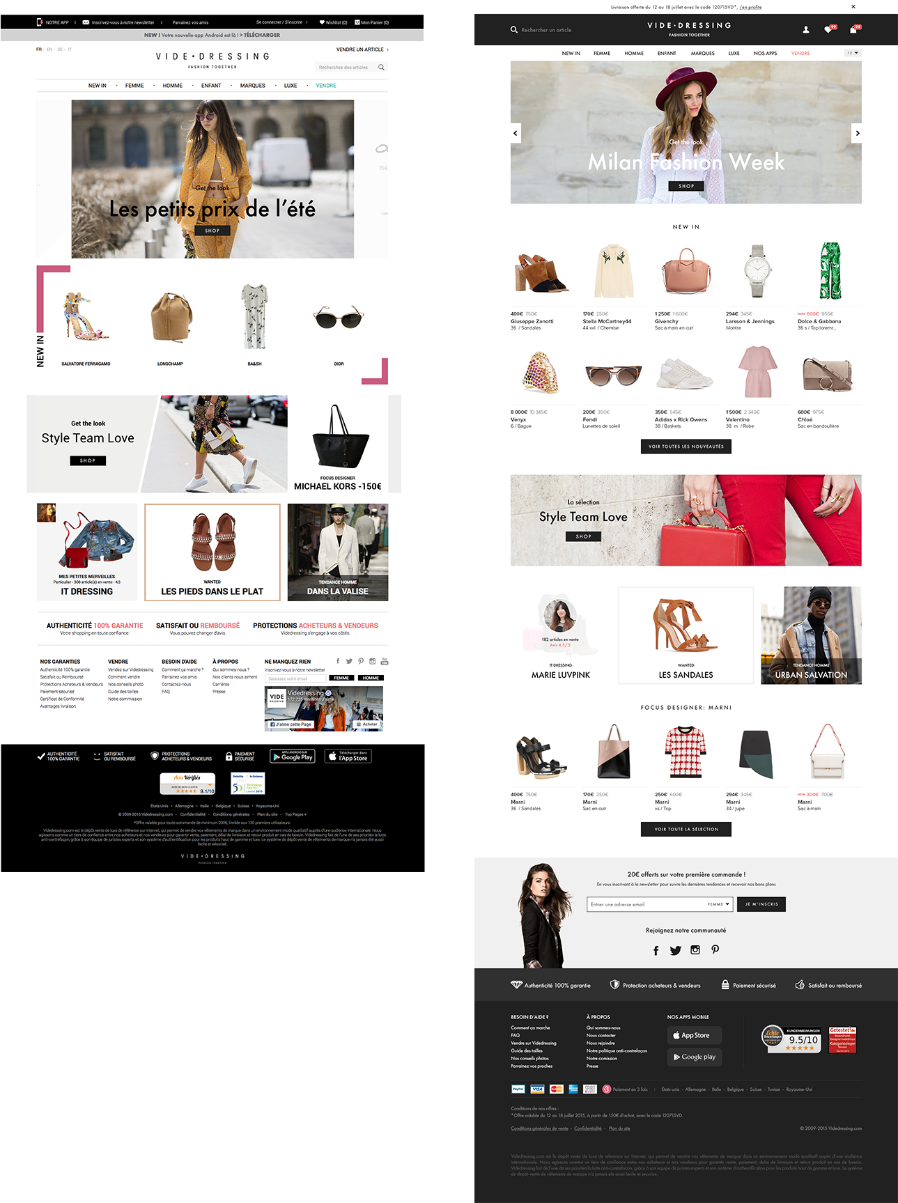
Review of the Videdressing desktop Homepage
CONTEXT
As we recently launched a mobile website and an android app both initiated with a new brand identity, we wanted to spread this new identity over all our platforms in order to harmonize every Videdressing interfaces whether you’re on mobile or desktop. We also wanted to give a new high-end look and feel, and improve the user experience. To reach our goal we made a new header a new footer and a quick review of the content. Discover all the evolutions down here.
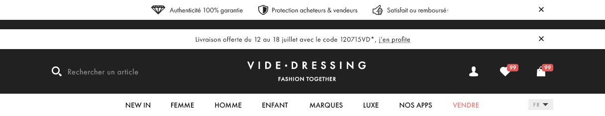
A REVIEWED PROMOTIONAL BANNER
Taking place before the main header to avoid the interference with the homepage content this banner displays different messages from discounts to reinsurance and allowing to the user to close it if necessary.
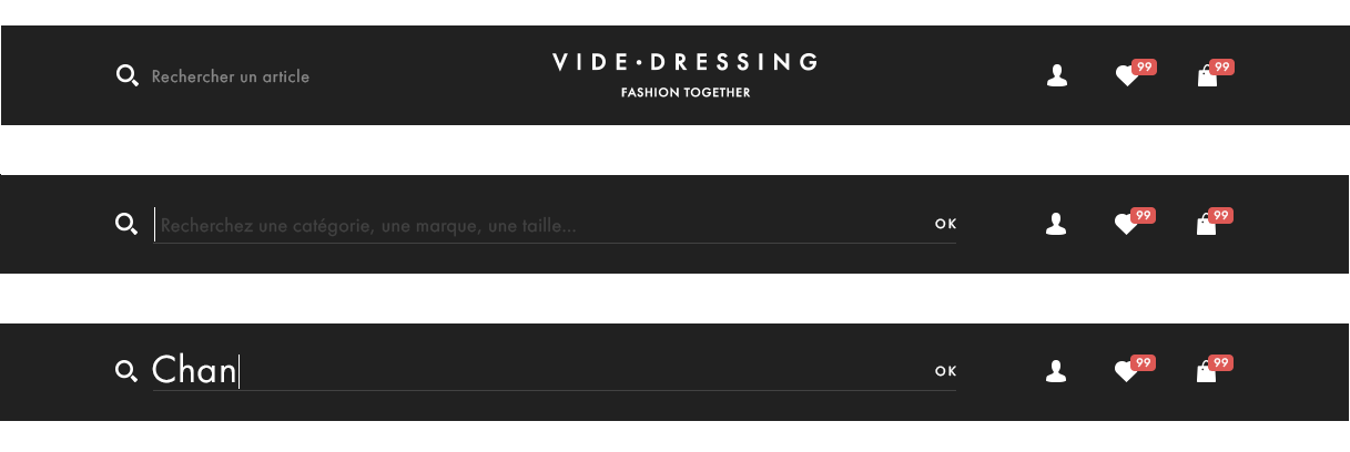
A MODERNIZED SEARCH ENGINE
Easy to access, its left corner position allows it not be confused with other informations. The search engine is now a central way to navigate on the site due to its new opening animation which makes it more immersive for the user giving a handy and pleasant experience.
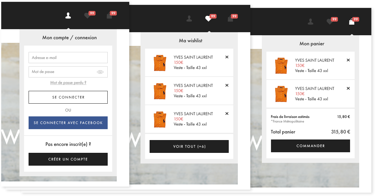
A CLEARER PERSONAL NAVIGATION
The access to the user personal navigation is now quick and easy by just clicking the different “account”, “wishlist” and “cart” icons on the top right corner of the header.
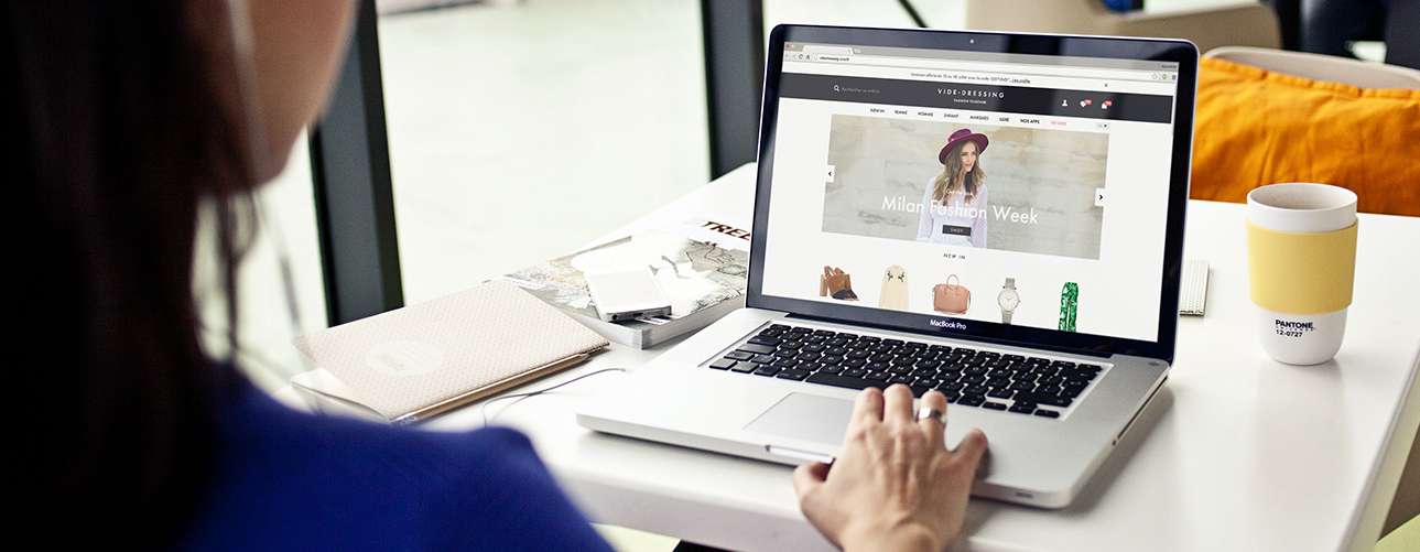
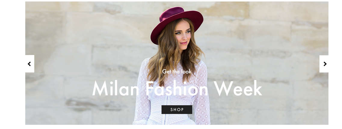
A FULL WIDTH SLIDER
For a better immersion we choose to enlarge the main slider and make it fit the full website width we reduce the height to pull up the waterline and make more content directly accessible on one screen.
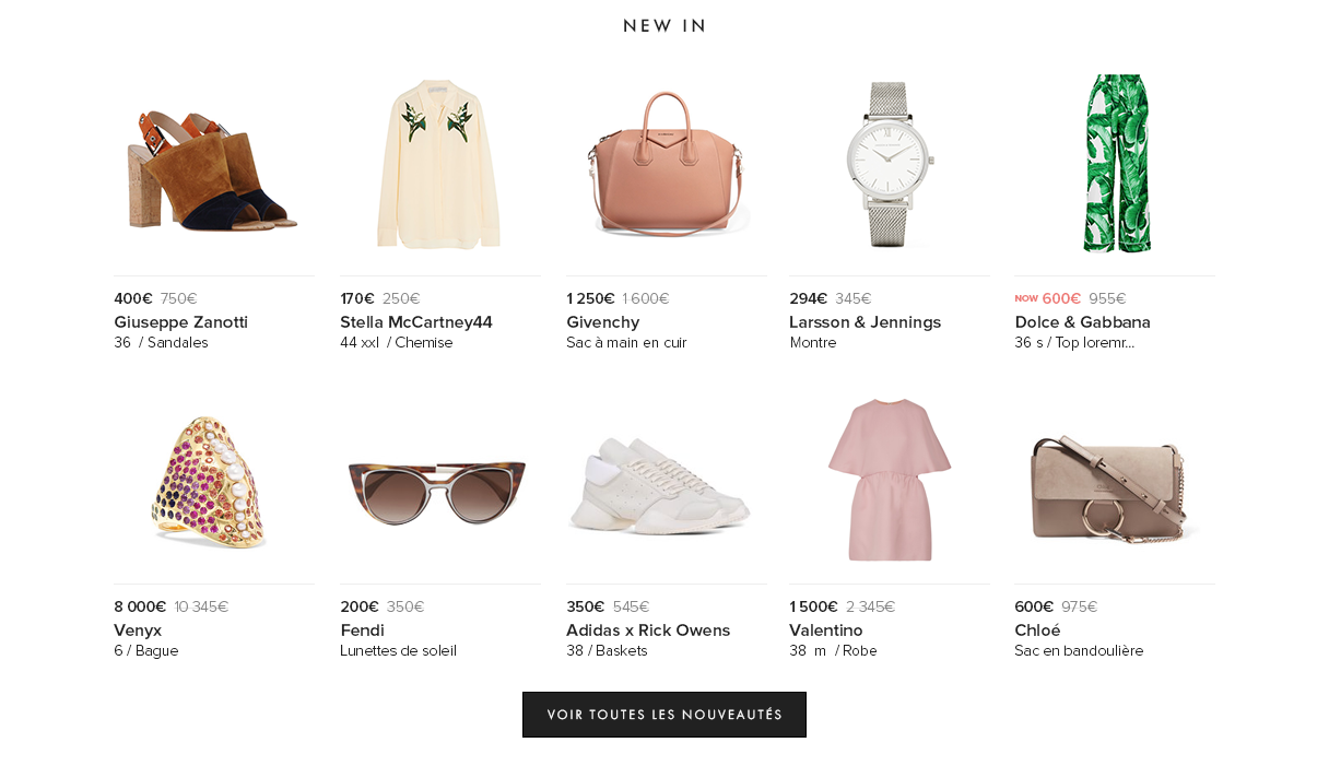
MORE PRODUCT RECOMMENDATIONS
Users can access directly to more new products on the homepage. We now show up 10 “new in” products on the homepage giving the user an extend choice.
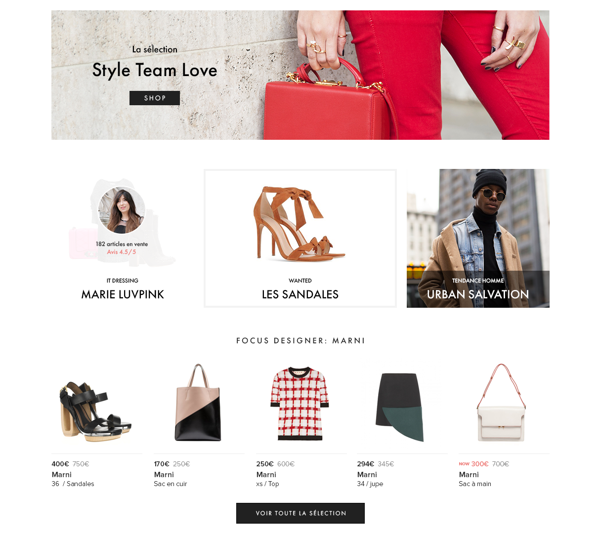
A NEW SELECTIONS DISPLAY
We cleared the display of all our curated selection reviewing their distribution and their appearance. Users can now easily access to a selection of the best pieces curated by our style team, and also the best dressings, the “wanted” selection and the men selection. The focus designer is now a direct access products display with a call to action leading to a larger selection of the brand pieces.
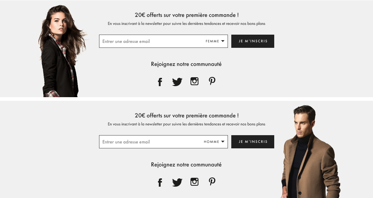
A STRONGER INTERACTION WITH THE BRAND
Higlight the brand interactions by enhancing the social media and the newsletter subscription. Try to integrate some personal navigation changing background images by switching the gender in the text field.
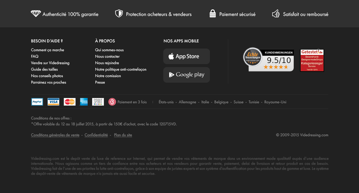
A BETTER READABILITY
The prioritization of the informations has been reviewed for a better readibility and smoother access to the different informations available in the footer.
OLD VS NEW